Torq Table
Award winner at the 2021 SIT International Furniture Design Awards
Torq Table was a concept born in March 2020, when the world was told to stop what it was doing and stay still.
The design came to life as a symbol of defiance of restrictions. Not a defiance of public health, but a defiance of anything that would get in the way of creativity and moving forward.
My family was safe and healthy. We live in a beautiful small town in the country with an endless backyard. Psychologically, we were set up much better than others to deal with the confinement, so I put my head down and got to work to develop a design that would get me busy with a pile of seasoned lumber and a pile of time that I knew wouldn’t last. The studio I built in 2000 is 20 feet from my house, an easy commute and easy to quickly duck out to, to tweak a curve, to push a line, or to edit a punctuation in the evolving design.
Images of the microscopic virus on the constant news stream showed a menacing orb with spikes reaching out as it rotated. The virus kept spinning, just as the news cycle kept spinning. We were to fear those spikes reaching out at us as it spun; if just one of those things nicked us, we were in trouble.
As soon as it was mentioned that when a vaccine is miraculously developed, that getting vaccinated was going to be an option, it was clear that this threat was never going to go away. We’re going to have to accept that it’s a daily risk that we will need to live with.
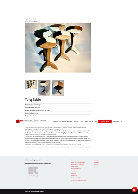
Torq Table represents our need to accept a new risk and move forward with it as it spins. As it evolves, we must evolve.
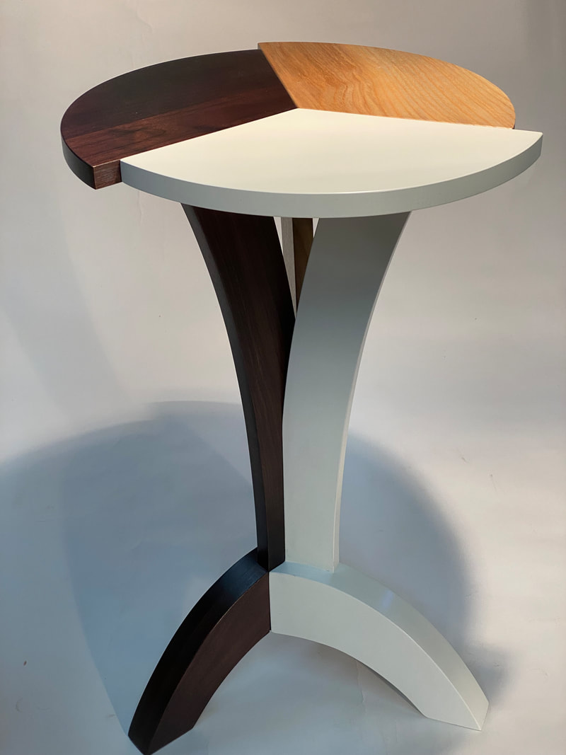
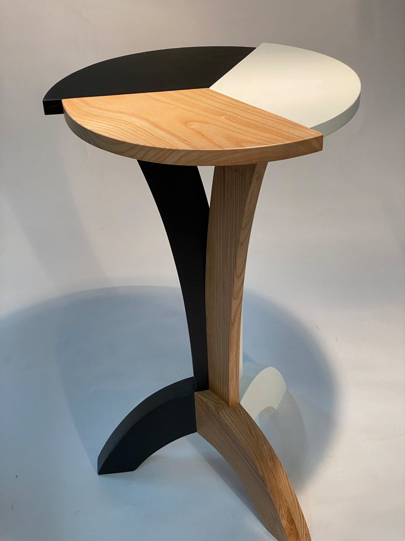
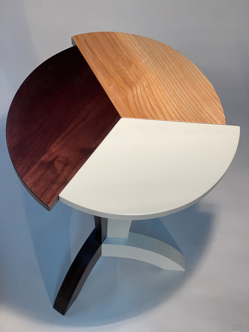
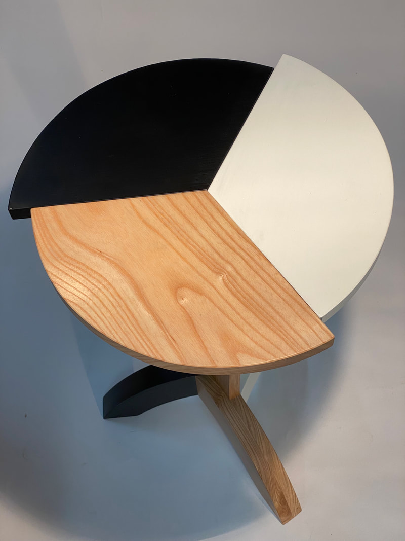
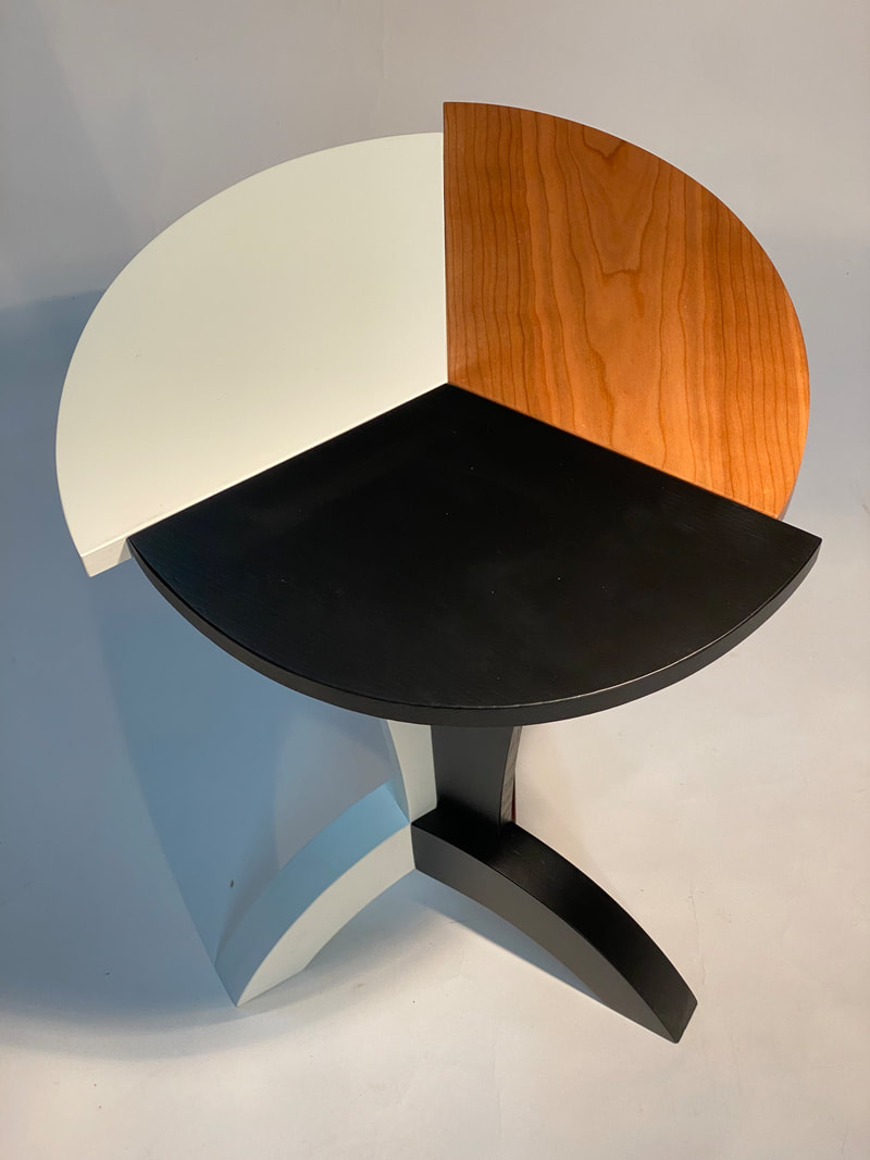
The base of the table is efficient and sturdy. It is balanced and each leg depends on the last one and the next one to complete its form and character. It depends on this unity.
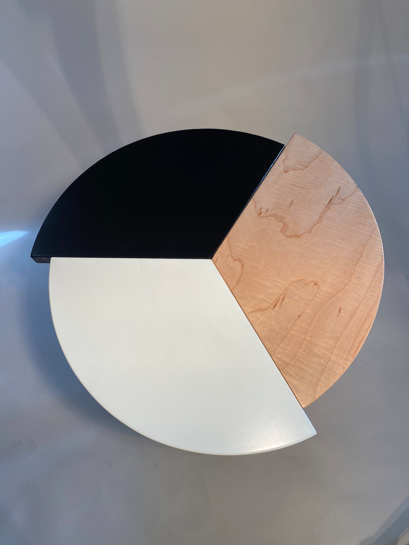
Like the base, the top is composed of 3 interconnected parts that also have their own different characters. An inert white lacquered section (hard maple), a black lacquered section with masked prominent grain (white ash) and a clear lacquered natural section (white ash, maple cherry or walnut) as a refreshing juxtaposition. It’s no coincidence that the slightly menacing offset corners reach out as the design rotates.
Around and around it goes, and we will go around with it, and even with our differences, we will manage and move forward in unity.
The design came to life as a symbol of defiance of restrictions. Not a defiance of public health, but a defiance of anything that would get in the way of creativity and moving forward.
My family was safe and healthy. We live in a beautiful small town in the country with an endless backyard. Psychologically, we were set up much better than others to deal with the confinement, so I put my head down and got to work to develop a design that would get me busy with a pile of seasoned lumber and a pile of time that I knew wouldn’t last. The studio I built in 2000 is 20 feet from my house, an easy commute and easy to quickly duck out to, to tweak a curve, to push a line, or to edit a punctuation in the evolving design.
Images of the microscopic virus on the constant news stream showed a menacing orb with spikes reaching out as it rotated. The virus kept spinning, just as the news cycle kept spinning. We were to fear those spikes reaching out at us as it spun; if just one of those things nicked us, we were in trouble.
As soon as it was mentioned that when a vaccine is miraculously developed, that getting vaccinated was going to be an option, it was clear that this threat was never going to go away. We’re going to have to accept that it’s a daily risk that we will need to live with.
Torq Table represents our need to accept a new risk and move forward with it as it spins. As it evolves, we must evolve.
The base of the table is efficient and sturdy. It is balanced and each leg depends on the last one and the next one to complete its form and character. It depends on this unity.
Like the base, the top is composed of 3 interconnected parts that also have their own different characters. An inert white lacquered section (hard maple), a black lacquered section with masked prominent grain (white ash) and a clear lacquered natural section (white ash, maple cherry or walnut) as a refreshing juxtaposition. It’s no coincidence that the slightly menacing offset corners reach out as the design rotates.
Around and around it goes, and we will go around with it, and even with our differences, we will manage and move forward in unity.
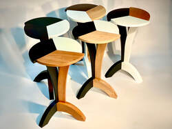
Walnut, Ash and White
Ash, Black and White
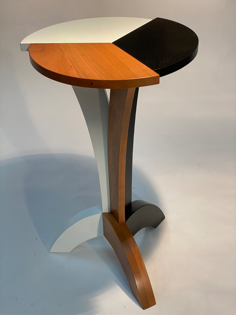
Cherry, Black and White
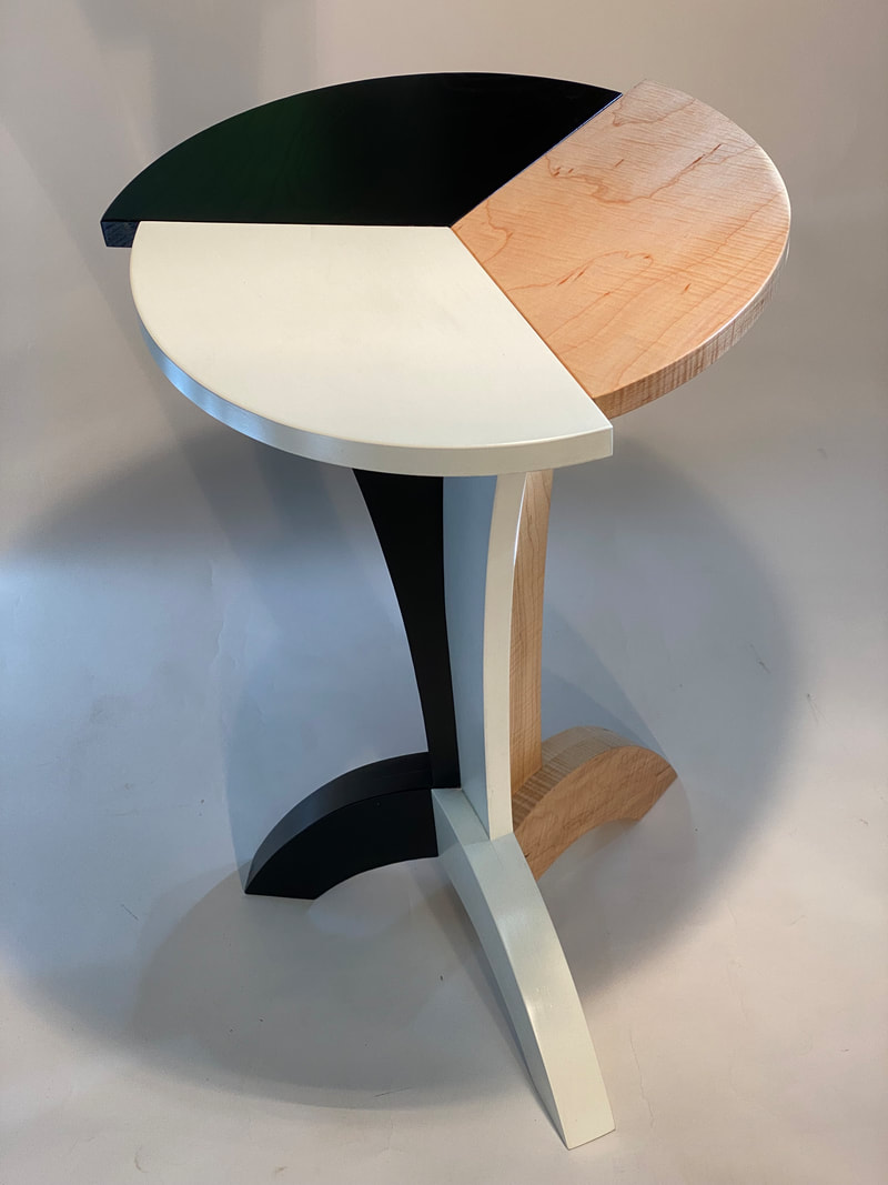
Curly Maple, Black and White ...Available at The Karger Gallery in Elora.
|
|